Wednesday, June 22, 2005

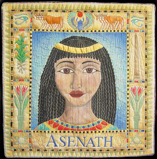
Asenath


This quilt is part of the national traveling invitational exhibit "Women of Biblical Proportion" curated by mother and daughter team, Ruth Harris and Chantelle Cory. "The exhibit portrays the rich diversity of female biblical characters through contemporary art quilts.

I chose Asenath, she was Josephs wife, as in the well known “Josephs Technicolor Dreamcoat” She was the daughter of an Egyptian priest. Asenath was also of interest to me because this is my sisters middle name.

This quilt was painted with Tsukineko inks and D’uva Chromacoal powders (for her skin) on raw silk. 22” x 22” 2003

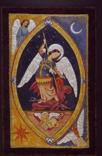
Saint Michael Overcoming Evil


The central image on this quilt is from an engraving from the renaissance, called St Michael overcoming Evil. When I saw this image it brought to mind our present history; one that President Bush has drawn parallels to by referring to our fighting the axis of evil. Tsukineko inks were used to paint the main images and backgrounds. The wings are painted with Lumiere paint. And colored pencils were used to add subtle shading to the oval border.
18 1/2” x 29” 2003

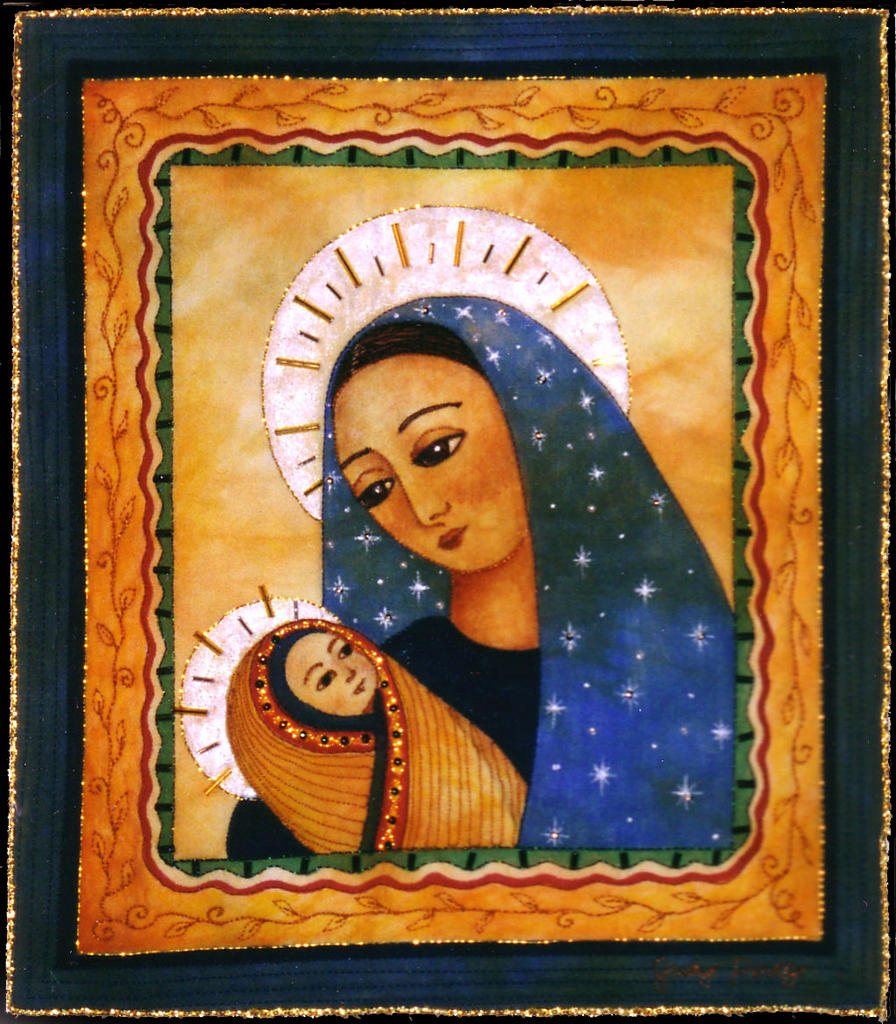
Madonna and Child


This small quilt was the first piece I painted with the Tsukineko inks. It is whole cloth, machine quilted and embellished with beads and gold cording.
9” x 10” 2002

Nina’s Leopard


One day my daughter Nina mentioned that I had never done a quilt with a leopard on it. I decided to humor her and painted an image of a leopard on a moonlit walk through a dark and mysterious jungle. I realized I was trying to capture a quality I sometimes see in her, which makes it a very special quilt.

whole cloth black fabric painted with Lumiere paints. 36”x 21” 2002

Graven Images

I was inspired to make “Graven Images” while visiting cemeteries in New England, following up on some ancestral research. I found the symbols and images carved into the various stones fascinating in design, symbolism and historical context. Wanting to recreate the look of stone in cloth, I hand dyed fabric in shades of gray using various techniques to emulate stone. I enlarged my photos of the stones and traced the designs using tracing paper. I put my dyed fabric over the line drawings on a light box and traced the designs with pencil. The images were free motion quilted onto fabric and batting sandwiches creating dimensional images as though carving them into the fabric with needle and thread. Colored pencil was added to the recessed areas to create more depth. After the panels were quilted I trimmed them and arranged them filling in any holes with small strips of quilted carved stone details and pieced them together.

The most haunting aspect of making this quilt was that after working on it, on and off for two years quilting the various panels, I spent 3 straight days piecing it together and began putting the binding on it the morning of September 11, 2001. I found this to be so unsettling; I did not feel comfortable showing the quilt for a year.
50” x 79” 2001

This was the first quilt I entered into the IQF show in Houston in 2002, it won Judges Choice and 3rd place Art Quilt Large.

Tuesday, June 21, 2005

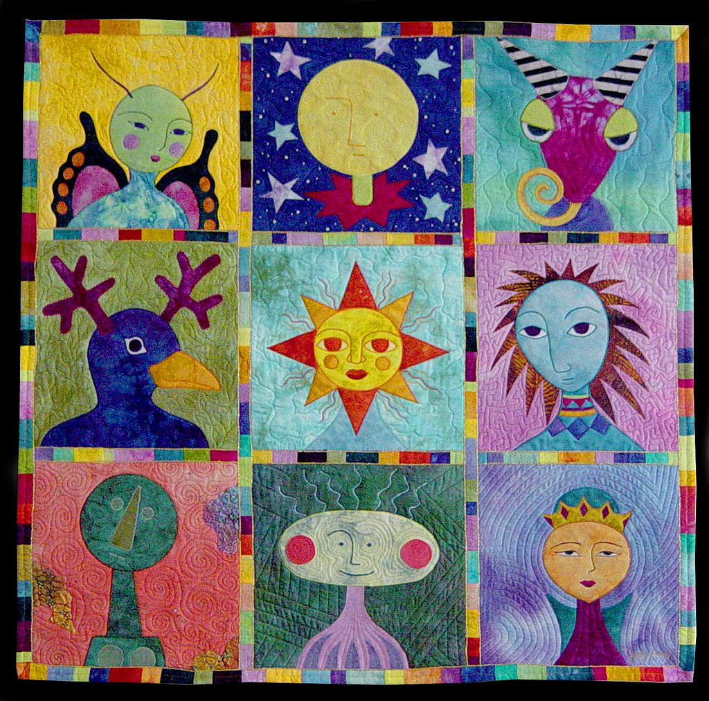
Noggins


I started making a series of heads on 12” square pieces of fabric. The images were machine apliqued onto the background fabric. I used some commercial fabric but mostly hand dyed fabric. The butterfly wings have clear micro beads fused onto the pink areas, and the head in the bottom left has some painted and beaded Tyvek on the edges. Each block was quilted individually and then sewn together with a wide satin stitch that was covered by a fused sashing strip with the edges couched with gold cording.
37” x 37” 2001

Word Quilts

Tea


This quilt was the first in a series of word quilts. The definition from the dictionary of the word tea is written on the center panel. With a teacup drawn on fusible interfacing fused on top of the writing. The tea bag is made from sheer interfacing filled with snippets of fabric. 14” x 12” 2000

Heart

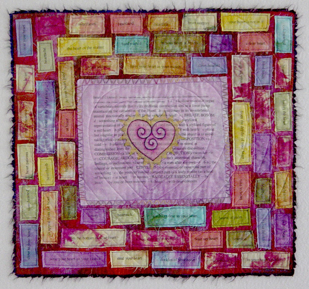
This quilt was the second in the series, this expanded on the idea of language and the different things one word can mean. The definitions of the word heart is in the center of the quilt. The illustrated heart is made from fusible interfacing, colored with Prisma brand colored pencils. Surrounding the central image are all the related idioms such as heart sick, heart throb, and whole hearted. I transferred the type onto the fabric using Citrasolve from toner based laser prints.

Hand dyed fabric and crochet cotton, citrasolve transfers, fusible
interfacing, raw edge appliqué 23”x 21” 2001

All Men Are Created Equal
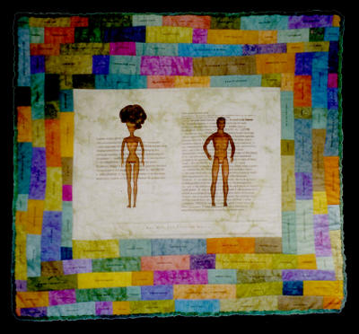

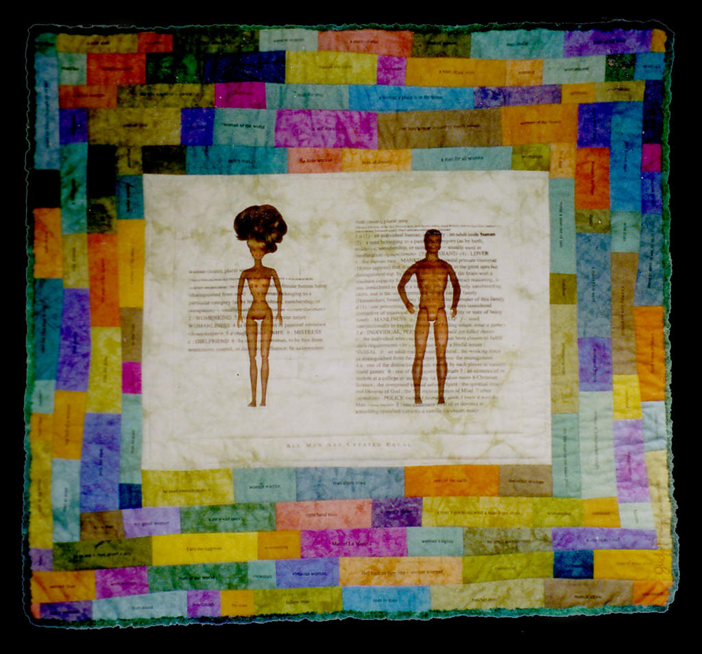
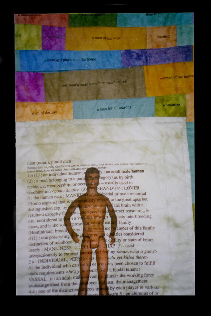
This was the last in the series. The definitions of woman and man are printed on the quilt. With the related idioms in the rectangles around it. I thought it was interesting to see how much more extensive the definition of man is. I sold this quilt and Tea too quick and do not have good slides only these photos. Make sure you get slides etc. before you sell your work, later you will regret not having it documented. 31” x 29” 2001